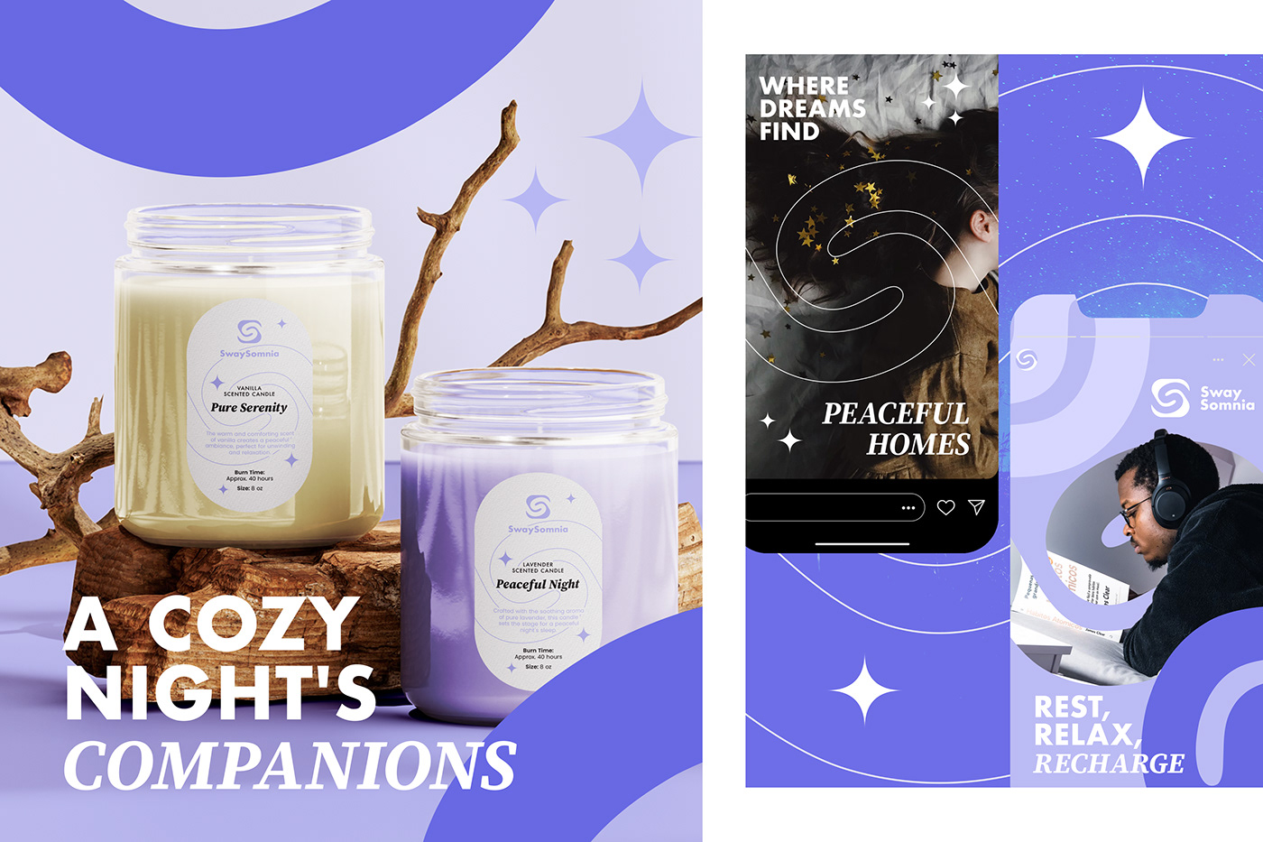
SwaySomnia
THE CLIENT: SwaySomnia is a brand dedicated to promoting relaxation, tranquility, and peaceful sleep. It offers a range of products designed to help individuals unwind, find comfort, and create serene environments.

BRAND VALUES: SwaySomnia is dedicated to creating a world of serenity and tranquility, where individuals can find solace, rest, and rejuvenation amidst the chaos of daily life. They understand the importance of relaxation in a fast-paced world and are committed to providing customers with the tools to achieve it.
The products are thoughtfully crafted to improve the quality of life, from enhancing sleep to supporting mindfulness practice, which SwaySomnia encourages and celebrates as a path to self-awareness and inner peace.
The products are thoughtfully crafted to improve the quality of life, from enhancing sleep to supporting mindfulness practice, which SwaySomnia encourages and celebrates as a path to self-awareness and inner peace.

LOGO: The "S" shaped like a wave symbolizes the calming and soothing qualities of SwaySomnia's products. It evokes a sense of peacefulness and serenity, reinforcing the brand's mission to help customers find their own moments of tranquility. The use of a rounded square to enclose the "S" creates a visual association with mobile app icons. This choice implies that interacting with SwaySomnia, whether through products or services, is as easy and intuitive as using a well-designed app. The clean, geometric shapes of a sans-serif font contribute to a sense of balance and tranquility, aligning with SwaySomnia's mission of promoting well-being and relaxation.


BRAND COLORS: The color palette of Marino Sunrise has been thoughtfully curated to embody a sense of chic sophistication. It adheres to a minimalist aesthetic, primarily featuring classic black and white as the foundational colors. This monochromatic tone gracefully extends to numerous accompanying visuals, where black and white photography adds an element of timelessness. To punctuate the brand with a touch of vibrancy and connection to the coastal ambiance, subtle accents of orange have been thoughtfully introduced. Orange, reminiscent of the warm hues that grace the sky during sunrise, is an ideal choice to represent the 'Sunrise' component of the resort's name. This inclusion of orange in the branding invites guests to forge a deeper connection with the natural beauty of the Mediterranean surroundings, invoking the gentle warmth of the sun and the golden allure of a seaside sunset.